Calligram


Estimated Time: 4 hours
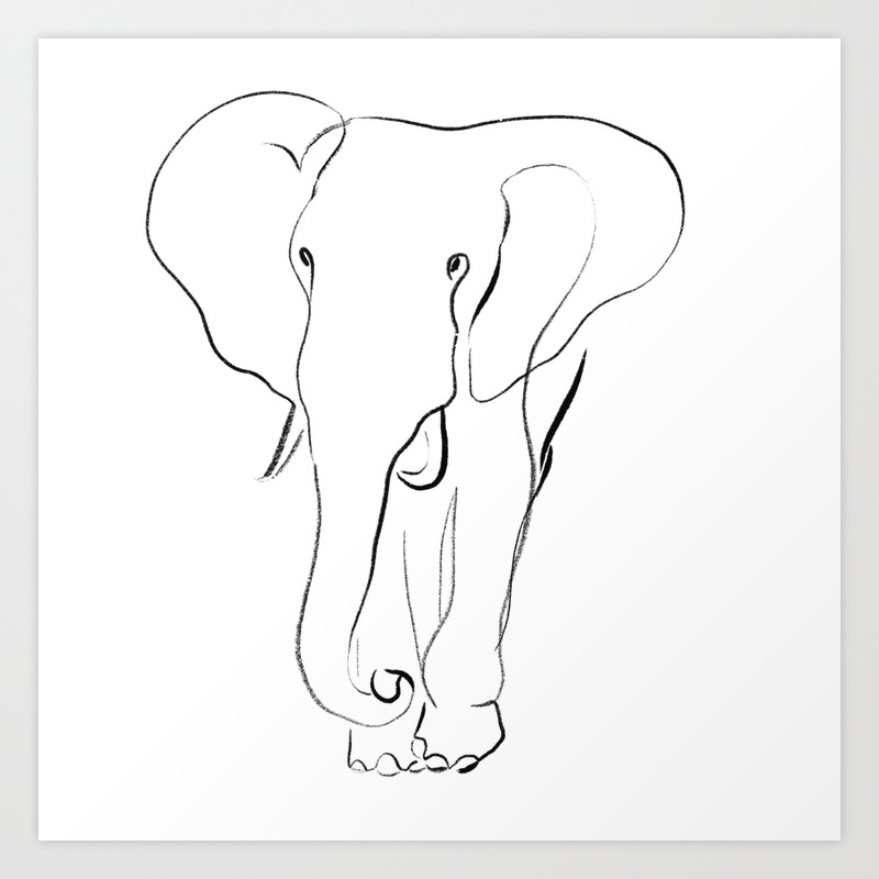
Pictured above are my letter to myself, reference image, and final project, respectively. I first started with my letter to my future self with some notes and thoughts on where I would like to be in 10 years. This was a free write in which I let my thoughts flood down onto the paper. Upon completion, I used these final thoughts and ideas to influence the final design. I chose to outline my words in the form of an elephant because of what these animals represent. In many cultures, elephants represent good fortune, wisdom, and protection. I found these qualities to work with the ideas I wrote to myself.
The elephant itself was constructed using the pen tool for the outline and Type on Path tool for the words. The trunk is composed with a combination of the Type on Path tool, convert to outline, and editing points. There are some altered text elements at the bottom, meant to represent grass, using a combination of the Pen tool, Text tool, and Envelope Distort > Make with Top Object. When these initial design elements were finished, the composition looked a bit empty, which led me to the idea of framing the elephant. I wanted to simulate a newspaper background and accomplished this with several layers. A white rectangle creates the background. I used the Area Text tool on top of this background to create the newspaper feel. The white inner rectangle, cropped close to the elephant, forces the subject to stand out from the background and creates this "frame" look. I chose to keep filler text and gibberish in the background text so as not to take away from the main text forming the elephant silhouette. The overall piece consists of rhythmic and repetitive elements, creating a very symmetrical, vibrant, and inspirational tone.


Elephants are very beautiful and gentle creatures and you captured their essence amazingly in this project. I really like that you added the boarder around the edges, it frames and emphasizes the subject very well. You could try experimenting with larger tusks to see if it makes the image easier to decipher. Overall great work!
ReplyDeleteThank you very much. This was one of my favorite projects this semester and I'm happy it came out as well as it did.
DeleteYou did an excellent job with this project, it was definitely one of my favorite calligrams. The way that you created a border with the excess text was clever, and it really enhanced the product overall. The only suggestion I have would be to maybe play around with the idea of adding a little bit more grass to make it look more purposeful, but it doesn't detract from the image the way that it is either. Good job!
ReplyDelete