Posts

Digital Media Portfolio
Image
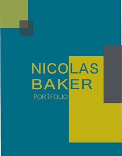
  This portfolio consists of all the major projects we completed in the Fall 2020 Digital Media class. The portfolio itself was created and edited using Adobe InDesign. The projects in the portfolio, however, were created using various Adobe programs, including Dreamweaver, Illustrator, and Photoshop. Artist's statements and project summaries accompany each piece. I chose this design after browsing through example portfolios and then brainstorming on my own. I went with a complimentary color theme along with neutral grays. The front cover, table of contents, contact page, and back cover all adhere to this color theme, but I chose to go with gray paper for the actual content because the blue sometimes interfered with the pieces I wanted to showcase. While the pages within the portfolio differ from the other 4 pages, the color theme is still present in the graphics in the top left corner. While I believe I could have lightened up some of the colors, I'm happy with how the portfol
Business Cards

Image
  These business cards were created using Adobe InDesign. They all incorporate my logo somewhere on the card. I began this project with sketches and basic ideas of what I want to do. The first sketch is along the same lines as a business card I previously designed. The third sketch was a very loose idea that didn't entirely come to paper the way I had imagined in my head. For this reason I created a fourth sketch, a vertical card, that I ultimately decided on for my final design. I liked the idea of a vertical card because they're not as common. For all designs, I went for a simple design. My personality is very to the point and mellow and I wanted my business persona and business cards to match that. For the first card, the main design elements are line work supplemented with my logo. This theme is matched front to back. I wanted the design of the second card to interact more with the logo, which I accomplished by getting the border line of the yellow background to line up wit

Somewhere

Image
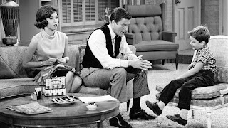
Time: 1 hour For this project, we had to photoshop ourselves into a movie or tv scene. I chose The Dick Van Dyke Show as it is one of my favorite tv shows and to challenge myself to focus more on lighting. I liked this particular scene because it's in the Petrie's living room, which is one of the main settings in the show. It also has the whole family which I thought would be cool to put myself into. The tone is somewhat serious so I took a picture of myself with the same feelings. The masking aspect of the project was much easier than it was at the beginning of this unit, but I found the lighting to be more difficult than I was expecting. For one thing, I didn't have any lighter clothing that might have fit into the time period which absorbed almost all of the light I was working with. I was able to lighten up my skin tones to look similar to that in the tv scene, but I couldn't quite get my clothes to match. I think wearing all black takes a lot of the focus of the sc

Pre-Somewhere Blog Post

Image
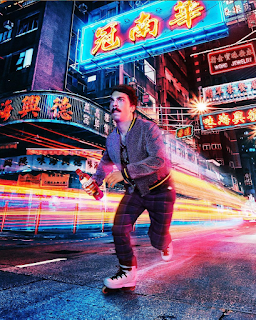
  This image is from Kirby Jenner's Instagram page (@kirbyjenner). While this image is really cool to look at and I can only imagine the skill it took to edit it to such perfection, I think this is one of the harder images to photoshop myself into.There are so many lights in differing angles and colors I find it hard to figure out how the light would play onto myself, where my shadows would lie, and how to edit the coloring of those lights. I found this picture on Average Rob's Instagram page (@averagerob). This was a cool post because of the creativity, simple as it is, that went into it. It inspired me to find a scene with exaggerated or dramatized elements. Or at least to implement my own to add some humor to the scene. I have followed James Fridman for a while so these edits did not come as a huge surprise, and still managed to get laughs out of me. While the images I went through were all funny in one way or another I found this image to be the funniest. It has a touch (a

Autoscopy

Image
  Estimated Time: 3 hrs An autoscopy is an edited self portrait. It's often conceptual and represents some kind of self reflection or experience. My final composition here is composed of 6 images (including the original) as well as some edits to hue and saturation and various other filters and edits, such as light spill and lens flares. I worked on a fine art spatial/galactic piece a few years ago which influenced the direction of this piece. I first started with the original image and brainstormed some ways I could play around with it. I found that the sky played a big role in the composition, and tried changing it's color to something more fantastical. This edit, combined with the train tracks, which I have always found adventurous and mysterious, influenced me to push the fantastic elements further. This is when I brought in the galaxy, planets, and floating woman. Each component is masked out and certain elements have altered opacity levels. The fire in the foreground was a

Logo Tag Brush

Image
  This project was completed using Adobe Photoshop. I took the logo I had created previously and created a tag brush out of it. This idea was a very fun one to see through. It allowed me much more freedom in my logo design than I had before. It also changed the aesthetic and feel of the logo. Whereas before the simple lines and precise construction gave a very minimalist and clean look, the added textures and color creates a much more creative and inviting feel. While I love the new look I created using this particular logo, I feel that these textures take away from the original design in some aspects. The gradients and clean lines from the original logo are lost in the color, multiple layers, and layered textures. I feel that this technique would be better suited for a simpler design. I plan on refining my personal logo, experimenting with existing designs I have previously created, and using the tag brush technique to my advantage. This project has definitely pushed me to incorporate

Carbon Footprint Propaganda Poster

Image
   Est Time: 4 hours Environmental issues have always been important to me and figured it would be a perfect topic for my propaganda poster. I chose to speak specifically towards our carbon footprint. This message is conveyed not only in the slogan on the hat, but also with the background image. The "power plants" are meant to be similar in shape to bottles to represent the objects produced in power plants combined with the physical plants themselves as both aspects contribute to our carbon footprint. The smoke coming out of each bottle also serves to speak towards our harmful impacts on the earth. I wanted to add a bit of humor into the poster as well which is evident in the slogan. I find that, for myself, when topics are more lighthearted or broken up with humor, I pay more attention to it and am more willing to listen and take action. I chose to go with an analogous color scheme, mainly for aesthetic purposes. I played around with my background colors first, trying to fi